Pierluigi Baroncelli
Case studies
Resume
Glintpay Mobile App Redesign
Redesigned the iOS and Android apps end-to-end.

Lead Product Designer

12 months

1 PM, 1 User Researcher, 2 FE, 1 BE

Context: Ahead of a US push, Glint needed its iOS/Android app to feel trustworthy and simple: complete KYC, fund the account, and spend from Gold/fiat without confusion. The legacy experience buried critical controls and fragmented onboarding.

Goal: Reduce onboarding friction, surface primary actions, and make the card’s spending source explicit and confirmable—while aligning behaviour across platforms for faster delivery.
PROBLEM
The Glint dilemma: making spending from gold feel obvious and safe
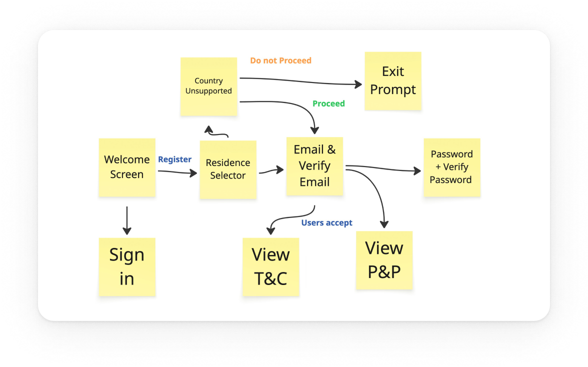
Glint’s card lets people spend from Gold, GBP, or USD—but the legacy app hid the control behind a horizontal swipe. Onboarding was branched and unpredictable, and day‑one actions sat below the fold. I rebuilt the core so it’s clear where money comes from, simple to get started, and consistent across iOS/Android.

The app had to be comprehensive
Cover essentials for day‑one success: funding, spending, exchanging, and card control—without detours.

The app had to be scalable
Support multiple wallets (Gold/GBP/USD) and markets, reuse the same truth across dashboard, exchange, and card settings.

The app had to be adjustable
Allow safe customisation (limits, source switching, education banners) and future personalisation without UX debt.
USER NEEDS
What people needed to feel in control
We interviewed existing and prospective users and reviewed support tickets to understand how trust is earned in a gold‑backed spending app.
01
Predictable verification
Linear KYC with clear progress and realistic time‑to‑complete.
02
Explicit control
Visible selector for card spending source with confirmation.
03
Fast first action
Primary CTAs reachable in one tap, predictable outcomes.
04
Inline clarity
Contextual hints (e.g., “Card spends from: Gold Wallet”) over generic help.
Exploration
Choosing the dashboard pattern
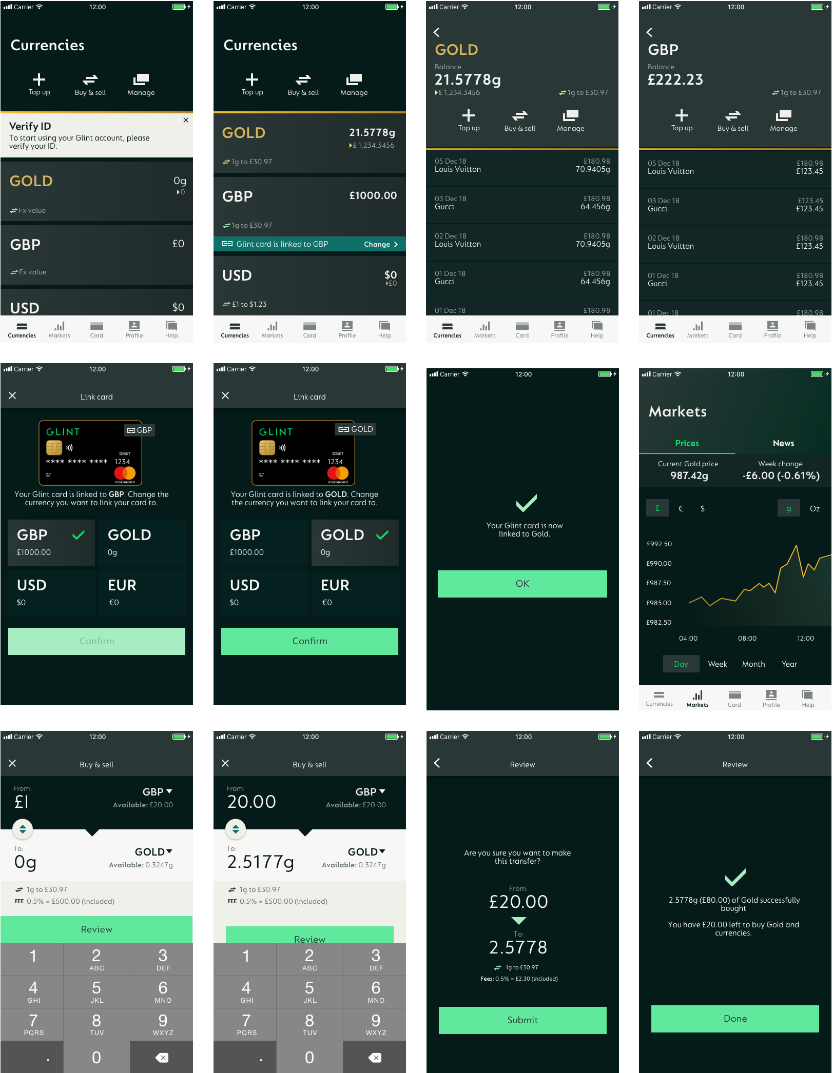
The core problem was how to make the card‑linked currency unmistakable on the Home screen in a mobile app where Gold behaves like a spendable currency. Research showed people missed the current source and didn’t trust the hidden interaction.
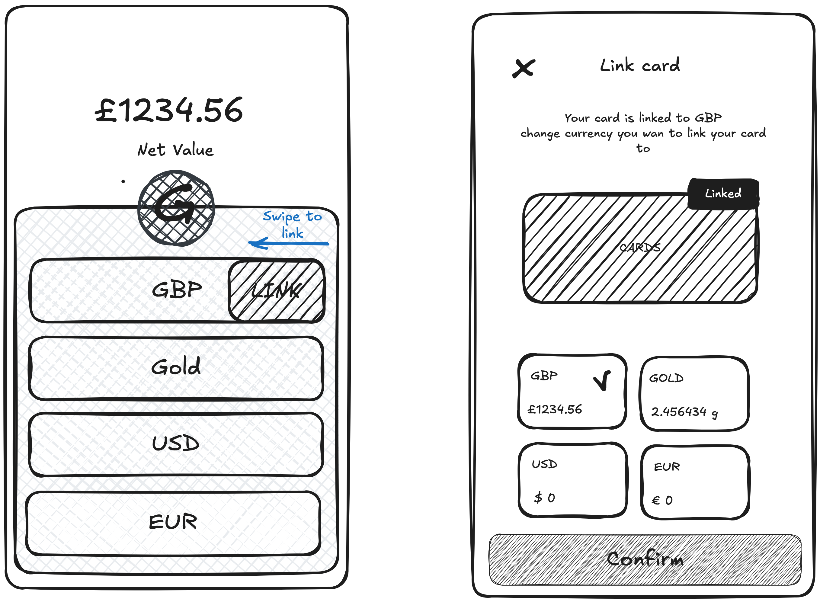
Option A Swipe‑to‑link (legacy): Users had to horizontally swipe the wallet list to change which currency the card used. In testing, the gesture was non‑discoverable and easy to forget; several participants changed sources by accident.
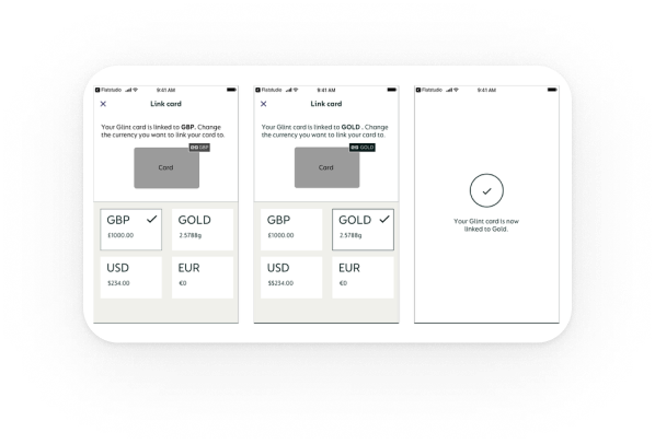
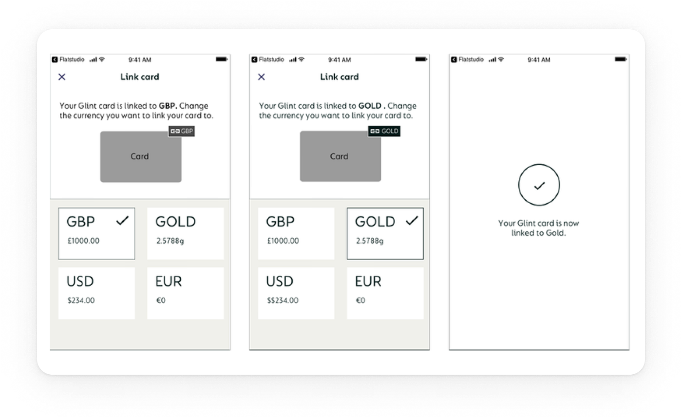
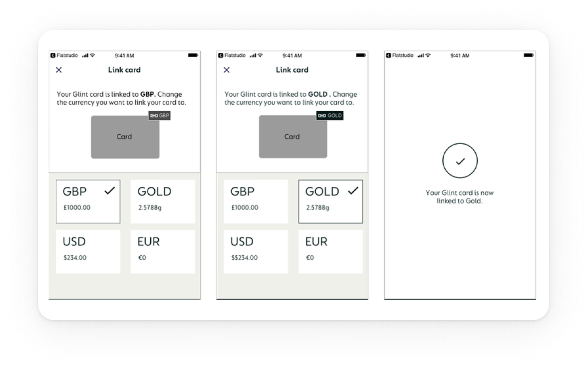
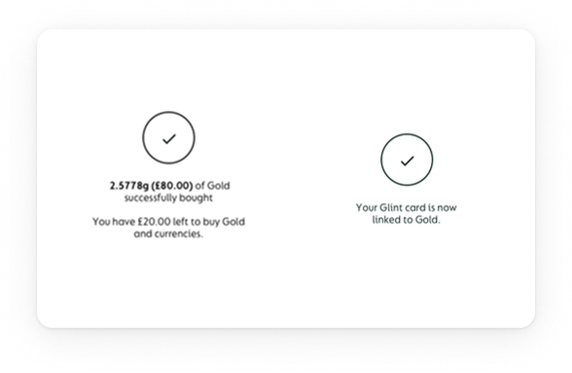
Option B: Modal switcher (chosen): A visible control opens a modal with all wallets (GBP, Gold, USD, EUR). Selecting a wallet shows a brief explanation and a confirmation step. This made the state explicit, removed the hidden gesture, and reduced errors.

Clarity: The modal to swap currency is explicit and visible. The previous swipe was non‑intuitive and effectively hidden.

Affordance: Clear control + “Linked” treatment makes it immediately clear which card is linked to which currency account.

Visibility: Wallet cards on the Home screen show each currency with its amount, increasing visibility and reinforcing trust before spending.
Final design
What shipped
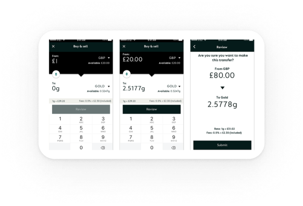
A clear dashboard with a persistent Card spends from control, and a predictable onboarding flow.
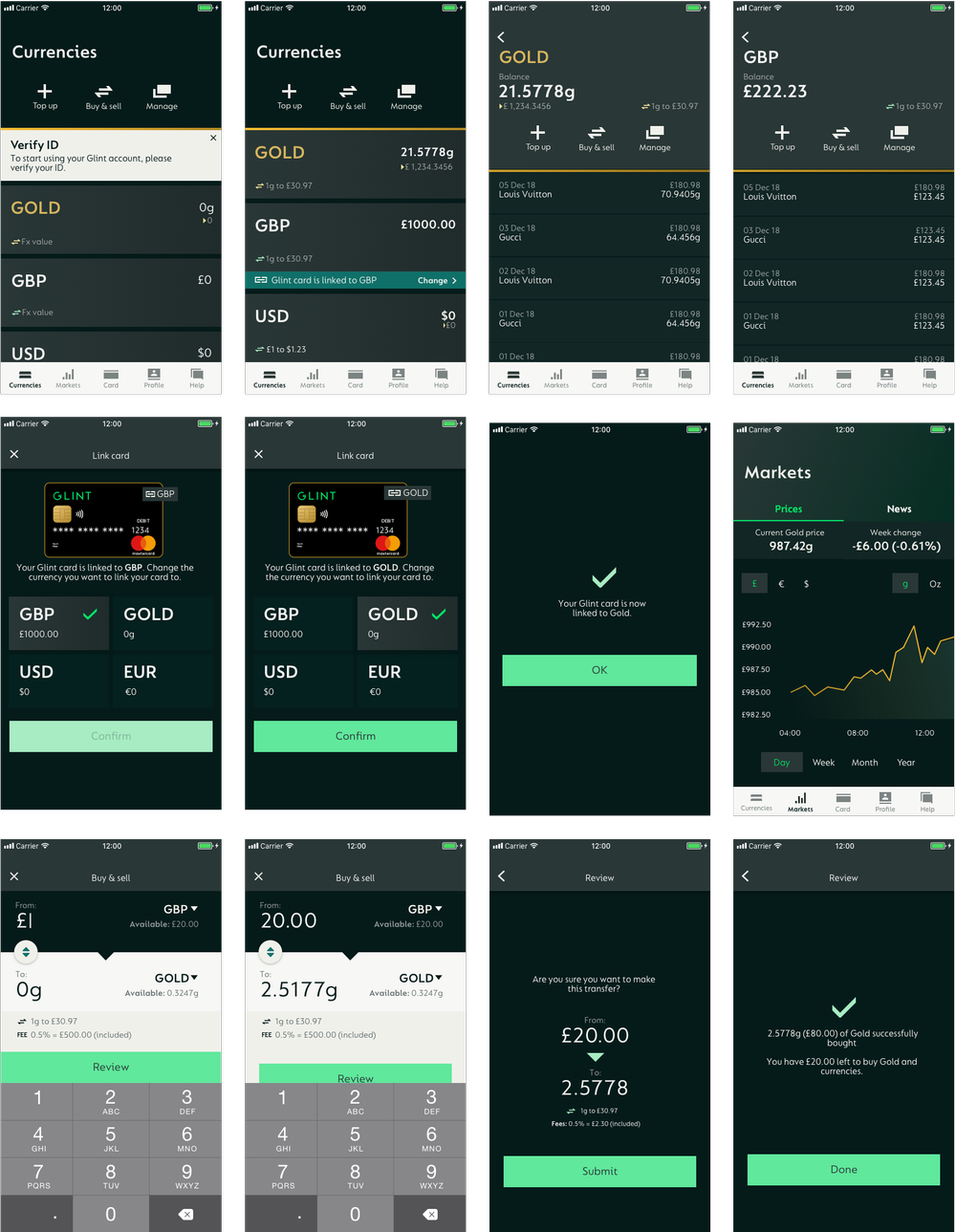
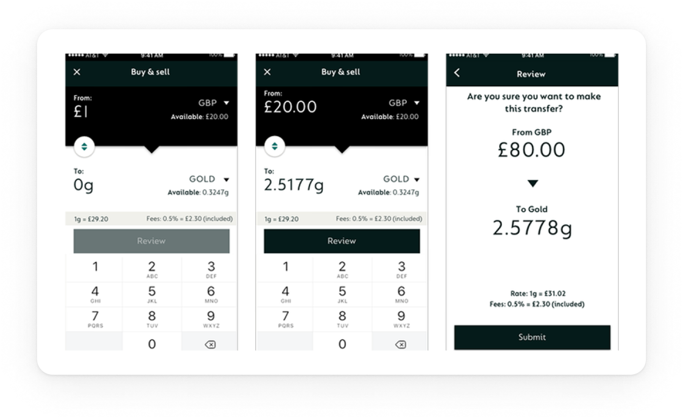
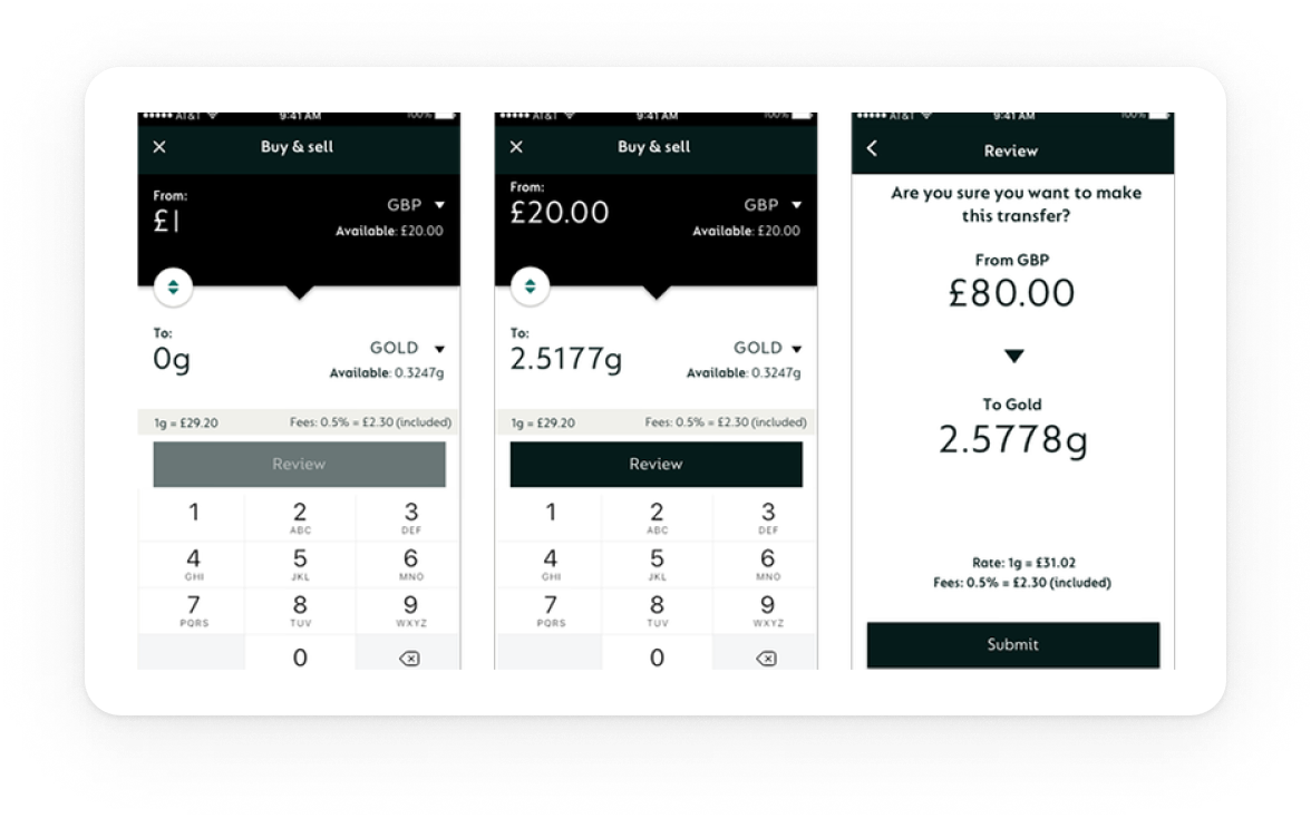
Dashboard header: Balances + Card spends from (Gold | GBP | USD) + primary CTAs (Add Money, Spend, Exchange)
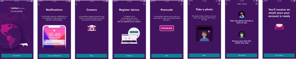
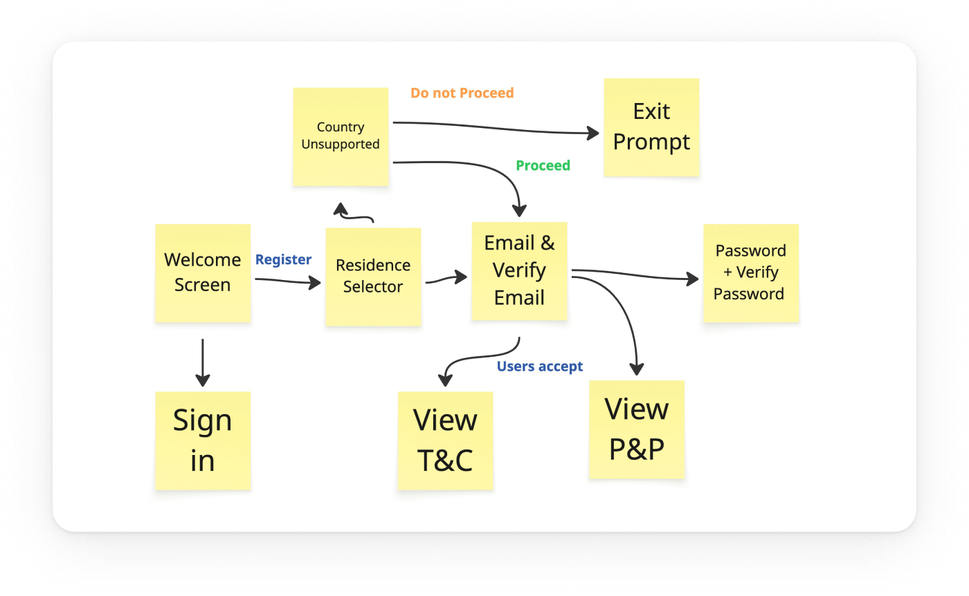
KYC & registration: Streamlined checks with clear progress and fewer dead ends and faster first access.
System: Shared components/tokens across iOS/Android; same behaviour, platform‑native feel.
IMPACT
Outcomes

Clarity & trust
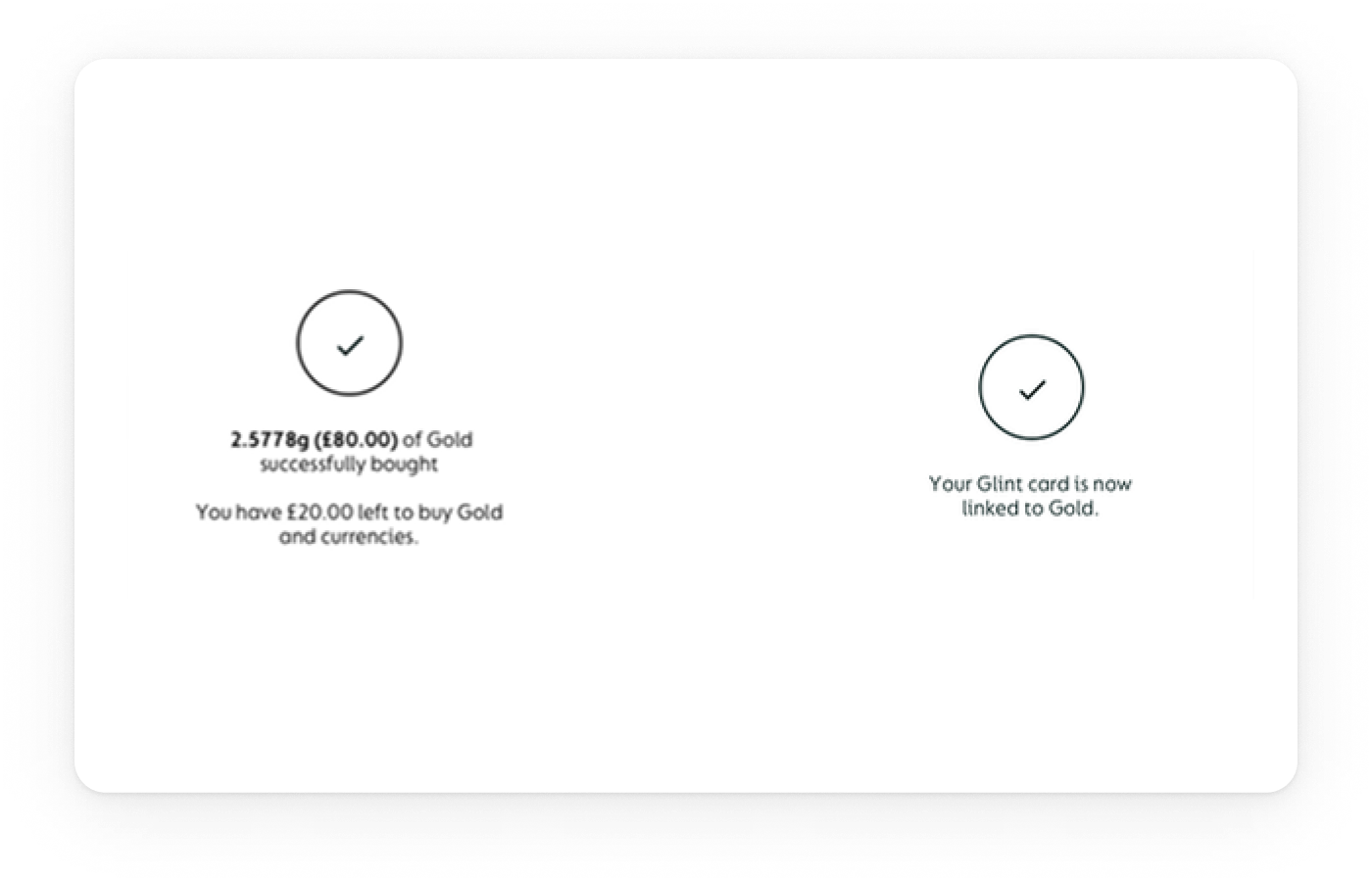
Switching from a hidden swipe to a modal plus confirm made the card‑linked currency explicit. The persistent Card spends from: label removed doubt and increased confidence before spending.

Control on Home
Putting Add Money, Spend, Exchange on the Home screen gave people immediate control of key actions

Activation speed
With source and balances visible on entry, more users completed add → spend in the same session.
LEARNINGS
What changed my mind
Patterns that seem efficient (gestures, branching) often erode trust when controls are safety‑critical.
Explore my earlier work
GG Design
Updating soon
Explore my earlier work on my previous portfolio while I prepare new case studies for this site.
View
Pierluigi Baroncelli
Case studies
Resume
Glintpay Mobile App Redesign
Redesigned the iOS and Android apps end-to-end.
Lead Product Designer
12 months
1 PM, 1 User Researcher, 2 FE, 1 BE
Context: Ahead of a US push, Glint needed its iOS/Android app to feel trustworthy and simple: complete KYC, fund the account, and spend from Gold/fiat without confusion. The legacy experience buried critical controls and fragmented onboarding.
Goal: Reduce onboarding friction, surface primary actions, and make the card’s spending source explicit and confirmable—while aligning behaviour across platforms for faster delivery.
PROBLEM
The Glint dilemma: making spending from gold feel obvious and safe
Glint’s card lets people spend from Gold, GBP, or USD—but the legacy app hid the control behind a horizontal swipe. Onboarding was branched and unpredictable, and day‑one actions sat below the fold. I rebuilt the core so it’s clear where money comes from, simple to get started, and consistent across iOS/Android.
The app had to be comprehensive
Cover essentials for day‑one success: funding, spending, exchanging, and card control—without detours.
The app had to be scalable
Support multiple wallets (Gold/GBP/USD) and markets, reuse the same truth across dashboard, exchange, and card settings.
The app had to be adjustable
Allow safe customisation (limits, source switching, education banners) and future personalisation without UX debt.
USER NEEDS
What people needed to feel in control
We interviewed existing and prospective users and reviewed support tickets to understand how trust is earned in a gold‑backed spending app.
01
Predictable verification
Linear KYC with clear progress and realistic time‑to‑complete.
02
Explicit control
Visible selector for card spending source with confirmation.
03
Fast first action
Primary CTAs reachable in one tap, predictable outcomes.
04
Inline clarity
Contextual hints (e.g., “Card spends from: Gold Wallet”) over generic help.
Exploration
Choosing the dashboard pattern
The core problem was how to make the card‑linked currency unmistakable on the Home screen in a mobile app where Gold behaves like a spendable currency. Research showed people missed the current source and didn’t trust the hidden interaction.
Option A Swipe‑to‑link (legacy): Users had to horizontally swipe the wallet list to change which currency the card used. In testing, the gesture was non‑discoverable and easy to forget; several participants changed sources by accident.
Option B: Modal switcher (chosen): A visible control opens a modal with all wallets (GBP, Gold, USD, EUR). Selecting a wallet shows a brief explanation and a confirmation step. This made the state explicit, removed the hidden gesture, and reduced errors.
Clarity: The modal to swap currency is explicit and visible. The previous swipe was non‑intuitive and effectively hidden.
Affordance: Clear control + “Linked” treatment makes it immediately clear which card is linked to which currency account.
Visibility: Wallet cards on the Home screen show each currency with its amount, increasing visibility and reinforcing trust before spending.
Final design
What shipped
A clear dashboard with a persistent Card spends from control, and a predictable onboarding flow.
Dashboard header: Balances + Card spends from (Gold | GBP | USD) + primary CTAs (Add Money, Spend, Exchange)
KYC & registration: Streamlined checks with clear progress and fewer dead ends and faster first access.
System: Shared components/tokens across iOS/Android; same behaviour, platform‑native feel.
IMPACT
Outcomes
Clarity & trust
Switching from a hidden swipe to a modal plus confirm made the card‑linked currency explicit. The persistent Card spends from: label removed doubt and increased confidence before spending.
Control on Home
Putting Add Money, Spend, Exchange on the Home screen gave people immediate control of key actions
Activation speed
With source and balances visible on entry, more users completed add → spend in the same session.
LEARNINGS
What changed my mind
Patterns that seem efficient (gestures, branching) often erode trust when controls are safety‑critical.
Explore my earlier work
GG Design
Updating soon
Explore my earlier work on my previous portfolio while I prepare new case studies for this site.
View
Pierluigi Baroncelli
Case studies
Resume
Glintpay Mobile App Redesign
Redesigned the iOS and Android apps end-to-end.
Lead Product Designer
12 months
1 PM, 1 User Researcher, 2 FE, 1 BE
Context: Ahead of a US push, Glint needed its iOS/Android app to feel trustworthy and simple: complete KYC, fund the account, and spend from Gold/fiat without confusion. The legacy experience buried critical controls and fragmented onboarding.
Goal: Reduce onboarding friction, surface primary actions, and make the card’s spending source explicit and confirmable—while aligning behaviour across platforms for faster delivery.
PROBLEM
The Glint dilemma: making spending from gold feel obvious and safe
Glint’s card lets people spend from Gold, GBP, or USD—but the legacy app hid the control behind a horizontal swipe. Onboarding was branched and unpredictable, and day‑one actions sat below the fold. I rebuilt the core so it’s clear where money comes from, simple to get started, and consistent across iOS/Android.
The app had to be comprehensive
Cover essentials for day‑one success: funding, spending, exchanging, and card control—without detours.
The app had to be scalable
Support multiple wallets (Gold/GBP/USD) and markets, reuse the same truth across dashboard, exchange, and card settings.

The app had to be adjustable
Allow safe customisation (limits, source switching, education banners) and future personalisation without UX debt.
USER NEEDS
What people needed to feel in control
We interviewed existing and prospective users and reviewed support tickets to understand how trust is earned in a gold‑backed spending app.
01
Predictable verification
Linear KYC with clear progress and realistic time‑to‑complete.
02
Explicit control
Visible selector for card spending source with confirmation.
03
Fast first action
Primary CTAs reachable in one tap, predictable outcomes.
04
Inline clarity
Contextual hints (e.g., “Card spends from: Gold Wallet”) over generic help.
Exploration
Choosing the dashboard pattern
The core problem was how to make the card‑linked currency unmistakable on the Home screen in a mobile app where Gold behaves like a spendable currency. Research showed people missed the current source and didn’t trust the hidden interaction.
Option A Swipe‑to‑link (legacy): Users had to horizontally swipe the wallet list to change which currency the card used. In testing, the gesture was non‑discoverable and easy to forget; several participants changed sources by accident.
Option B: Modal switcher (chosen): A visible control opens a modal with all wallets (GBP, Gold, USD, EUR). Selecting a wallet shows a brief explanation and a confirmation step. This made the state explicit, removed the hidden gesture, and reduced errors.
Clarity: The modal to swap currency is explicit and visible. The previous swipe was non‑intuitive and effectively hidden.
Affordance: Clear control + “Linked” treatment makes it immediately clear which card is linked to which currency account.
Visibility: Wallet cards on the Home screen show each currency with its amount, increasing visibility and reinforcing trust before spending.
Final design
What shipped
A clear dashboard with a persistent Card spends from control, and a predictable onboarding flow.
Dashboard header: Balances + Card spends from (Gold | GBP | USD) + primary CTAs (Add Money, Spend, Exchange)
KYC & registration: Streamlined checks with clear progress and fewer dead ends and faster first access.
System: Shared components/tokens across iOS/Android; same behaviour, platform‑native feel.
IMPACT
Outcomes
Clarity & trust
Switching from a hidden swipe to a modal plus confirm made the card‑linked currency explicit. The persistent Card spends from: label removed doubt and increased confidence before spending.
Control on Home
Putting Add Money, Spend, Exchange on the Home screen gave people immediate control of key actions
Activation speed
With source and balances visible on entry, more users completed add → spend in the same session.
LEARNINGS
What changed my mind
Patterns that seem efficient (gestures, branching) often erode trust when controls are safety‑critical.
Explore my earlier work
GG Design
Updating soon
Explore my earlier work on my previous portfolio while I prepare new case studies for this site.
View