Pierluigi Baroncelli
Case studies
Resume
University Profiles
Shipped a scalable profile system that lifted engagement and unlocked structured data reuse across THE products.

Lead Product Design

9 months

PM, Tech Lead, 2 FE, 1 BE

Context: THE’s legacy university profile pages were inconsistent, hard to update, and not aligned with design system tokens/components.

Goal: Create a modular, data-driven profile template that scales to thousands of institutions, improves discovery, and supports commercial modules (lead gen, programme promotion).
PROBLEM
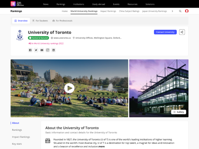
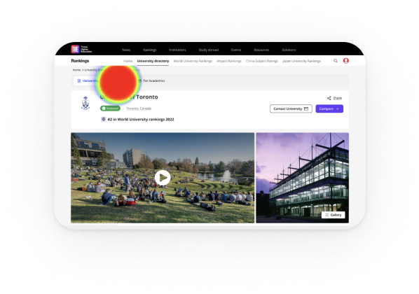
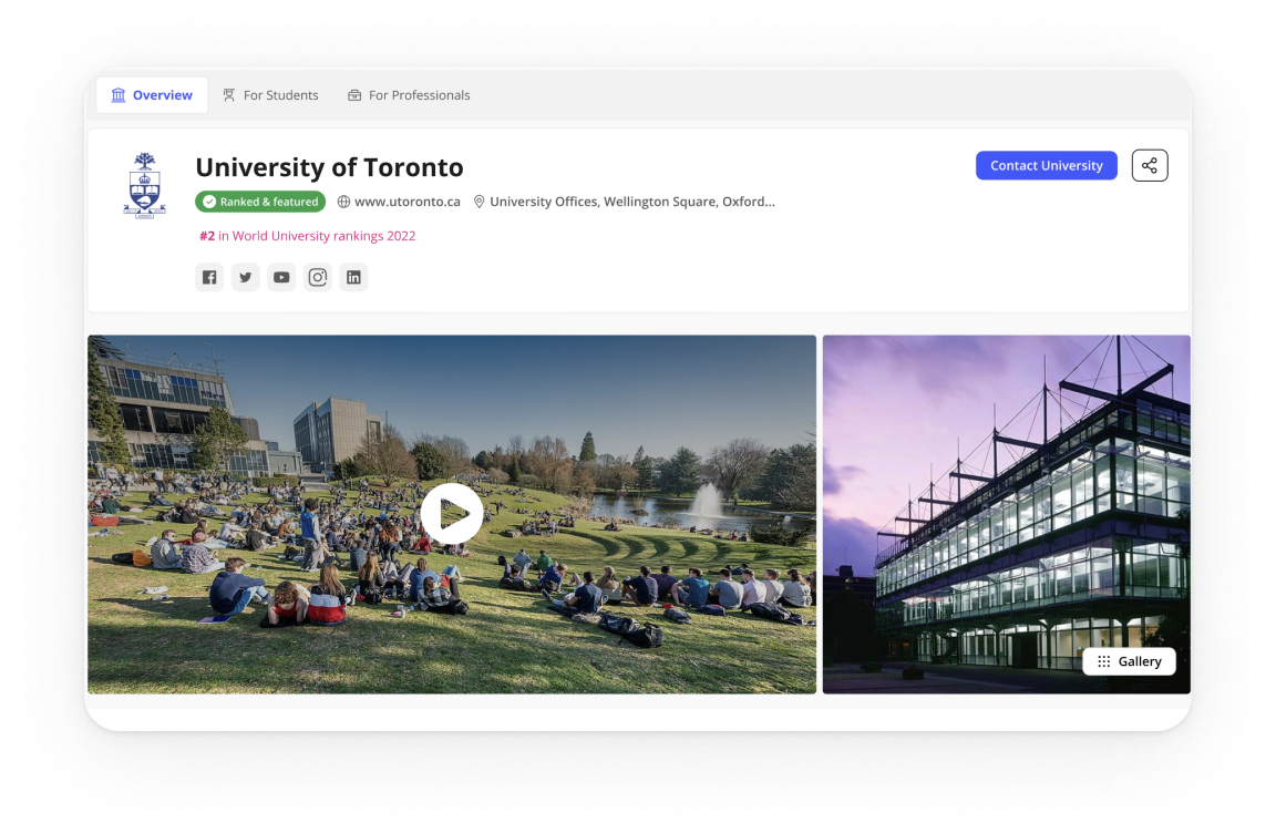
The Profiles Challenge: designing a consistent, trustworthy experience at scale
Legacy profile pages were inconsistent and costly to maintain. Content lived in multiple templates, data was duplicated, and updates were slow. Analytics showed people jumping straight to rankings, programmes, fees and admissions, yet that information was scattered. We needed a system that worked for thousands of institutions, aligned with the design system, protected SEO, and supported clearly labelled commercial modules.

Scalable and modular
Compose pages from configurable blocks built with the design system, so editors can adapt layouts by market while keeping a consistent experience.

Data-integrated and reusable
Pull from a single structured source (THE SaaS datasets), validate taxonomy, and expose blocks via a props API so content is reused across products and editorial effort drops.

Discoverable and trustworthy
Make rankings, programmes, fees and admissions easy to reach with jump navigation and clear headings; maintain AA accessibility, fast performance and stable URLs; label sponsored modules clearly.
USER NEEDS
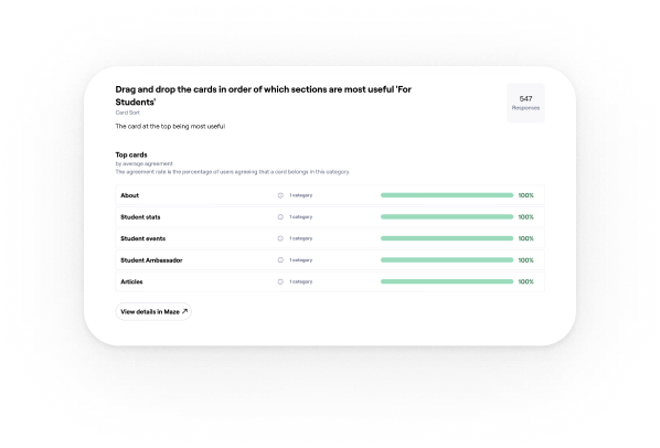
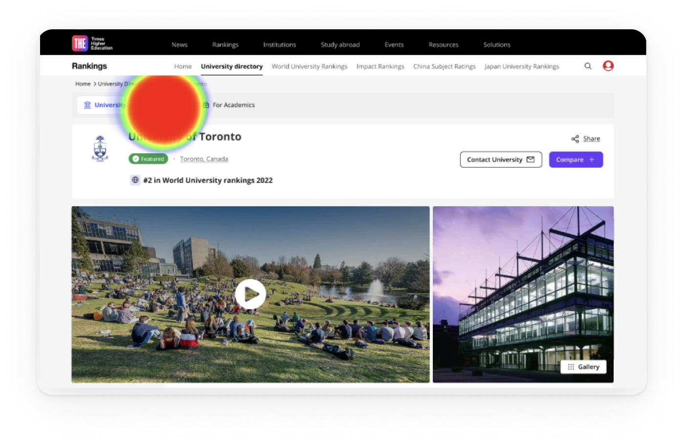
Research insights: how students and academics read and trust university profiles
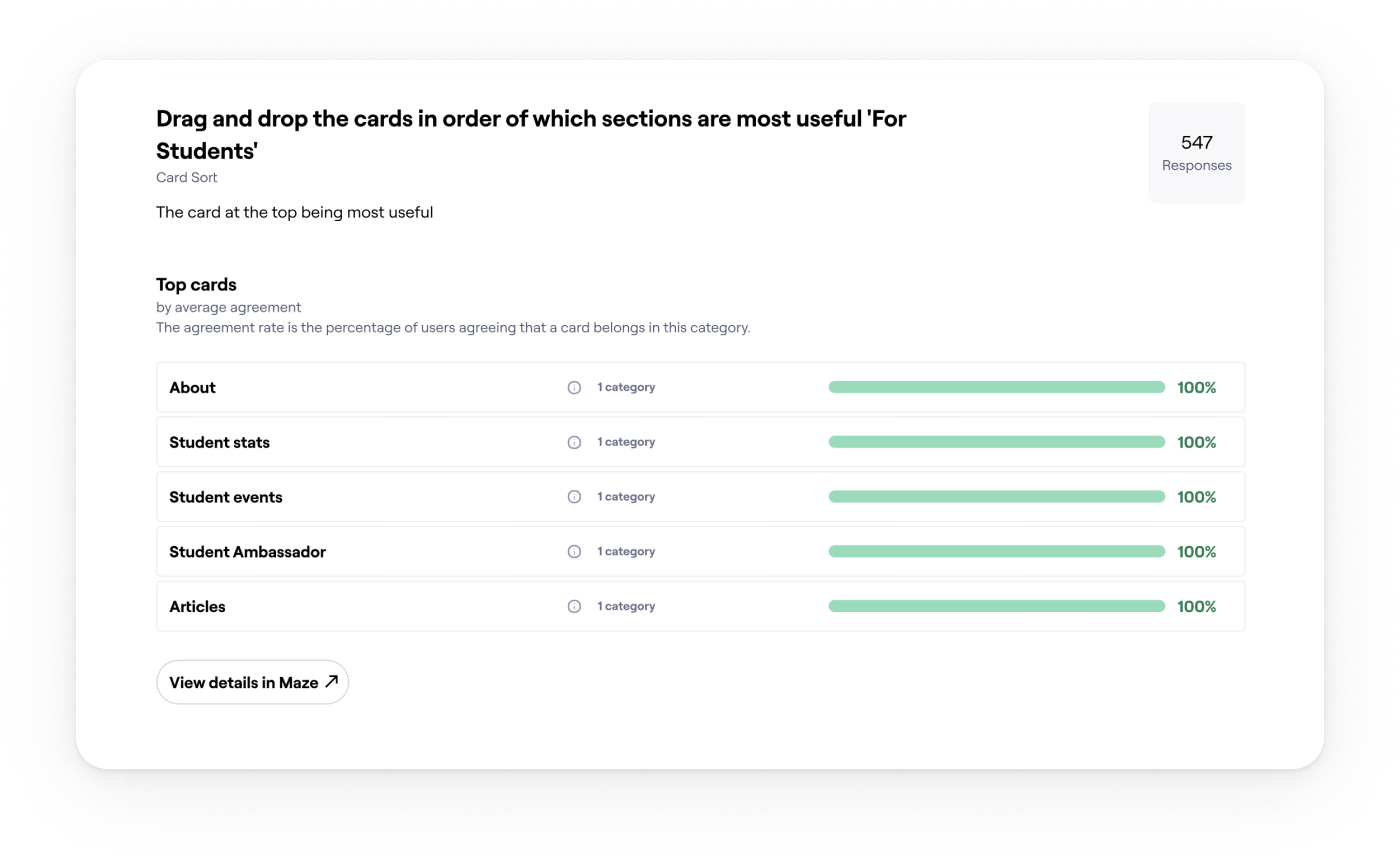
I ran stakeholder workshops with Editorial, Sales, SEO and Rankings. We combined Hotjar and analytics with Maze surveys and interviews to shape the block architecture and the content order.
01
Essentials drive decisions
Students come to decide. Fees, rankings, programmes and admissions must be visible first, so we surfaced them at the top with jump navigation.
Evidence: 77% said they would rely on the student profile to compare universities.
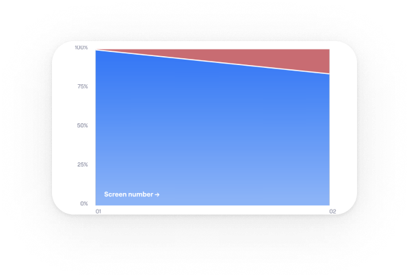
02
People decide fast and bounce if essentials are buried
Anchor navigation helped, but vague labels caused misclicks. Clear section names and stronger calls to action reduced friction on long pages.
Evidence: Over 80% reached the intended section in testing.
03
Long pages work when the top works
Hotjar and analytics showed early exits when essentials were buried, so we split content into modular, scannable sections.
Evidence: Structure validated with 700+ students worldwide.
04
One template cannot fit real data
Institutions publish uneven fields. We designed reusable blocks powered by DataPoints so pages adapt cleanly and scale to thousands of profiles.
Evidence: Modular sections aligned with the design system and live DataPoints indicators.
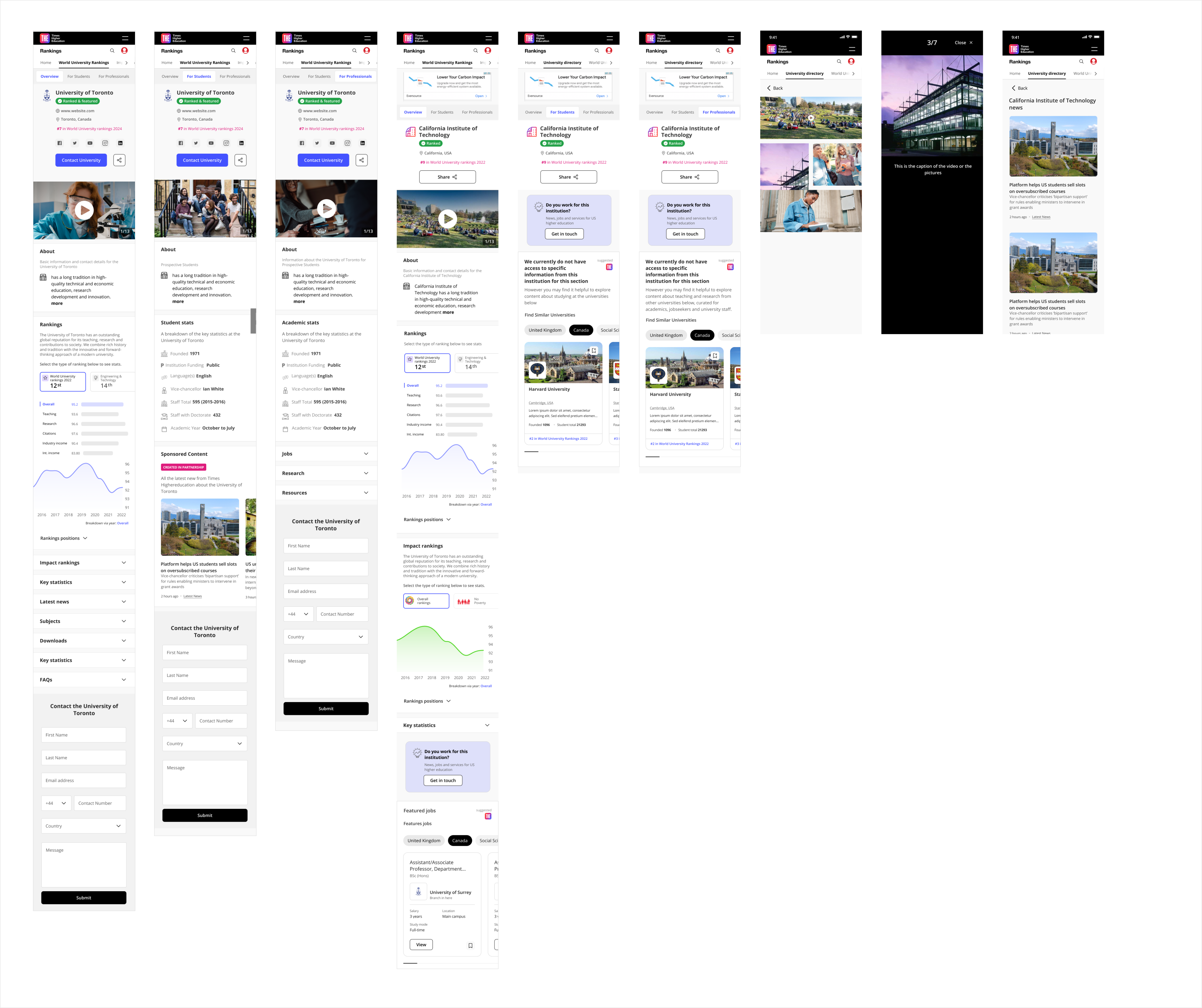
Exploration
Choosing the navigation pattern on desktop
I compared tabs, card hubs, and a long page with a sticky in-page navigation to keep orientation on data-heavy pages.
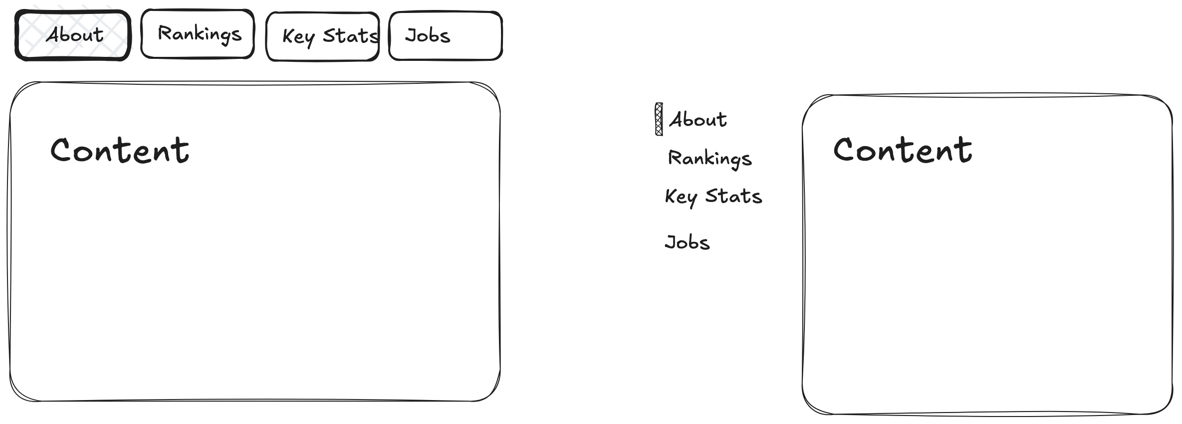
Final Decision on desktop: Use a long page with a sticky in-page nav and a key-stats strip at the top.

Faster first action: Students come to decide. Putting rankings, programmes, fees and admissions at the top lets them act quickly.

SEO and sharing stay clean: One URL with section anchors is easier to link and index.

Handles uneven data: Modular sections with sensible defaults and hide-when-empty rules keep layouts stable.

Easier to scale: New sections slot into the in-page navigation with a stable anchor.

Future proof: Anchored sections extend cleanly and keep existing links working.
ITERATION
Choosing the mobile pattern
I compared a long scrolling page on mobile with a tabbed layout that mirrors the desktop sections.
Final Decision on mobile: Tabs on mobile with Overview and Rankings open.
Essentials are visible at first view. The rest collapse to reduce noise. Tabs mirror the desktop sections so the mental model stays stable. Each tab maps to a section link for search and sharing.

Validation: Mobile testing showed higher task success and a shorter time to first tap once the first two tabs were open. Add your figures here.
FINAL DESIGN
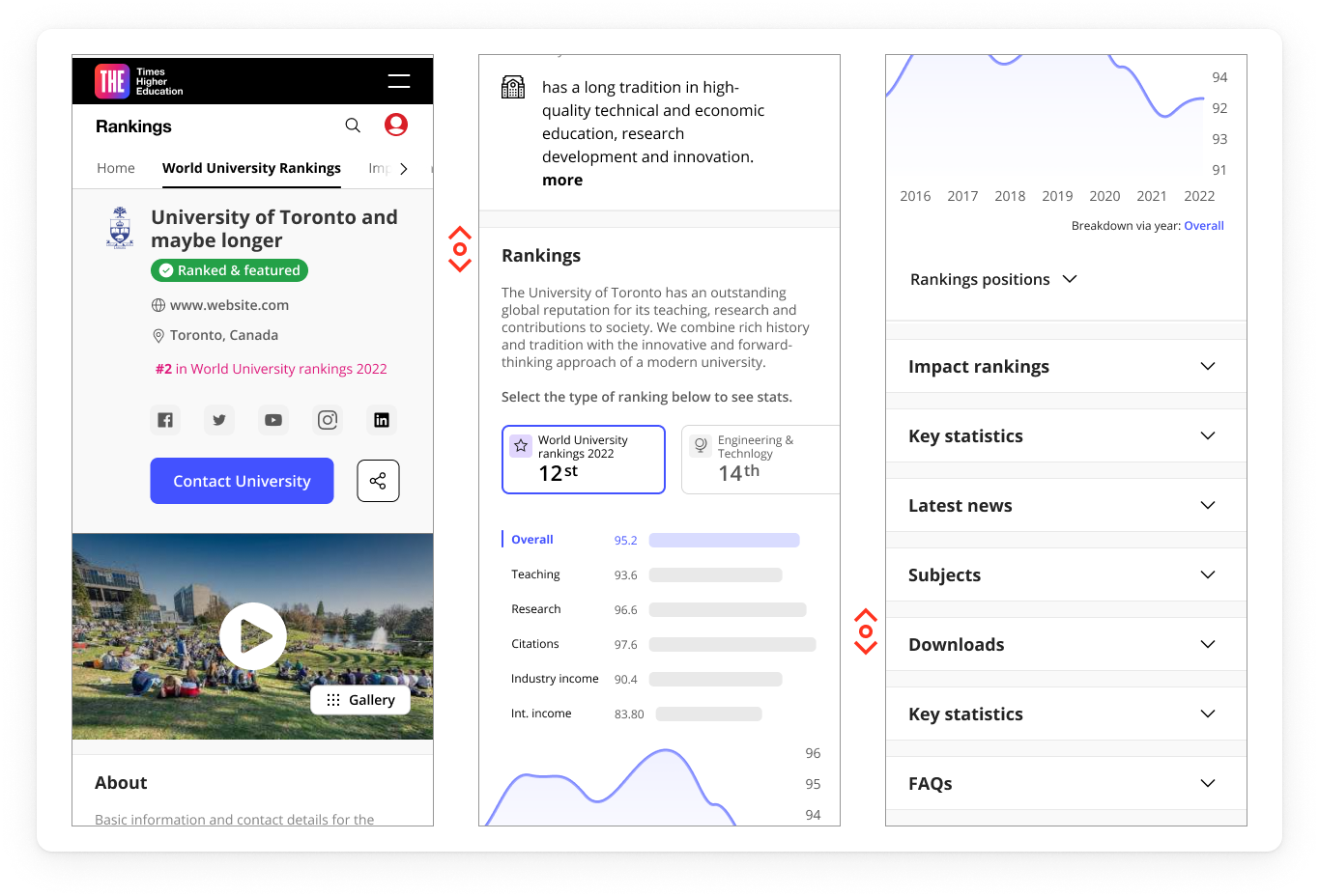
Solution at a glance
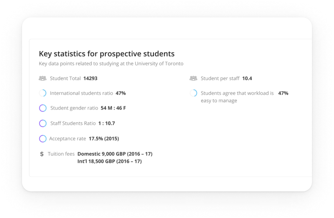
Key stats

Problem
Users arrived mid-decision and needed proof fast.

Design
A compact strip above the fold mirrors the main sections.

Impact
Quicker orientation and more clicks into the essentials.
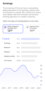
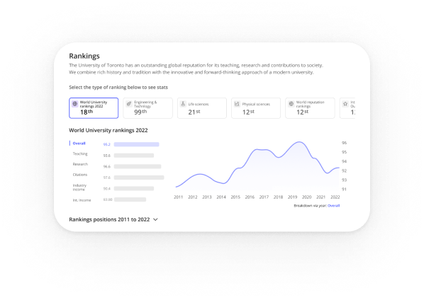
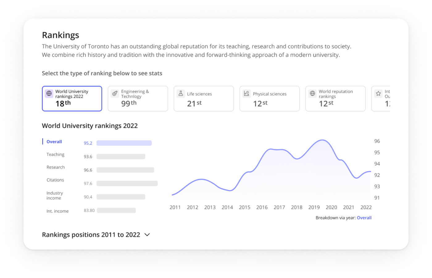
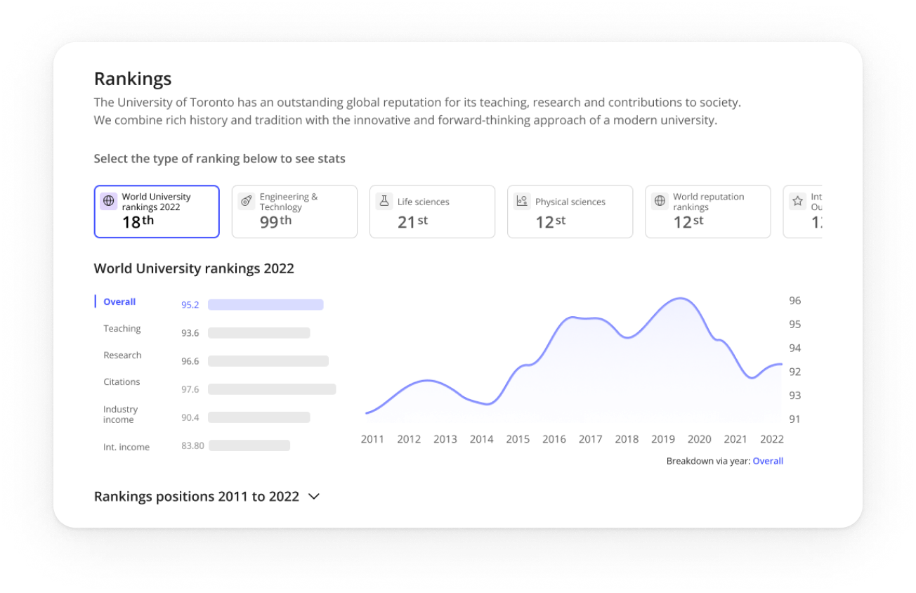
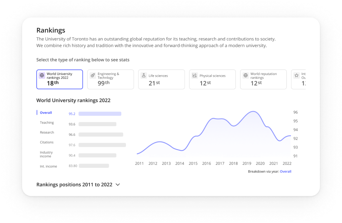
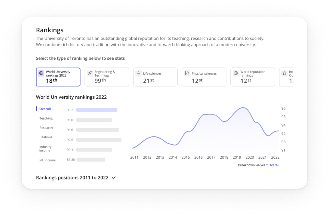
Rankings
Problem
Students compare options while academics and policy folks need citable context.
Design
Compact table shows score and trend with a visible Methodology link and Source note.
Impact
Confident comparisons for students and trustworthy citation for professional audiences.
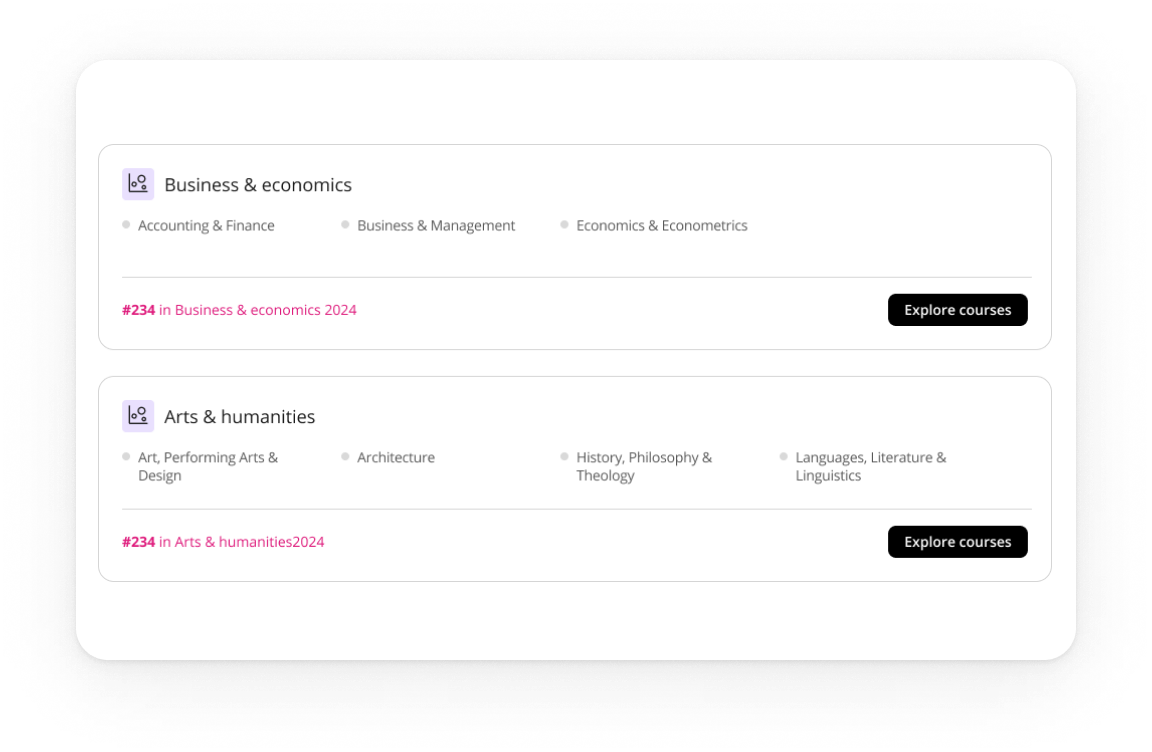
Programmes
Problem
Finding a relevant course and reaching enquiry took too many steps.
Design
Clear programme cards route straight into the enquiry flow, with a safe empty state.
Impact
Shorter path to contact and fewer dead ends.
Navigation
Problem
long pages caused misclicks on desktop and overload on mobile.
Design
sticky in-page navigation on desktop; tabs on mobile with Overview and Rankings open; anchors make every section linkable.
Impact
faster jumps, shorter time to first action, and easy growth for future sections.
Solution at a glance
IMPACT
Results

Engagement
People reached the right sections faster and spent longer with the content.

Conversions
More visitors moved from programmes to enquiry.

Trust
Professionals called out visible methodology and source as a trust signal..
LEARNINGS
What I’d carry forward
Plain labels beat clever names. Anchors must be obvious at the top and calmer on scroll. Tabs reduce mobile fatigue when only essentials open. Safe states and hide-when-empty rules unlock scale.
Pierluigi Baroncelli
Case studies
Resume
University Profiles
Shipped a scalable profile system that lifted engagement and unlocked structured data reuse across THE products.
Lead Product Design
9 months
PM, Tech Lead, 2 FE, 1 BE
Context: THE’s legacy university profile pages were inconsistent, hard to update, and not aligned with design system tokens/components.
Goal: Create a modular, data-driven profile template that scales to thousands of institutions, improves discovery, and supports commercial modules (lead gen, programme promotion).
PROBLEM
The Profiles Challenge: designing a consistent, trustworthy experience at scale
Legacy profile pages were inconsistent and costly to maintain. Content lived in multiple templates, data was duplicated, and updates were slow. Analytics showed people jumping straight to rankings, programmes, fees and admissions, yet that information was scattered. We needed a system that worked for thousands of institutions, aligned with the design system, protected SEO, and supported clearly labelled commercial modules.
Scalable and modular
Compose pages from configurable blocks built with the design system, so editors can adapt layouts by market while keeping a consistent experience.
Data-integrated and reusable
Pull from a single structured source (THE SaaS datasets), validate taxonomy, and expose blocks via a props API so content is reused across products and editorial effort drops.
Discoverable and trustworthy
Make rankings, programmes, fees and admissions easy to reach with jump navigation and clear headings; maintain AA accessibility, fast performance and stable URLs; label sponsored modules clearly.
USER NEEDS
Research insights: how students and academics read and trust university profiles
I ran stakeholder workshops with Editorial, Sales, SEO and Rankings. We combined Hotjar and analytics with Maze surveys and interviews to shape the block architecture and the content order.
01
Essentials drive decisions
Students come to decide. Fees, rankings, programmes and admissions must be visible first, so we surfaced them at the top with jump navigation.
Evidence: 77% said they would rely on the student profile to compare universities.
02
People decide fast and bounce if essentials are buried
Anchor navigation helped, but vague labels caused misclicks. Clear section names and stronger calls to action reduced friction on long pages.
Evidence: Over 80% reached the intended section in testing.
03
Long pages work when the top works
Hotjar and analytics showed early exits when essentials were buried, so we split content into modular, scannable sections.
Evidence: Structure validated with 700+ students worldwide.
04
One template cannot fit real data
Institutions publish uneven fields. We designed reusable blocks powered by DataPoints so pages adapt cleanly and scale to thousands of profiles.
Evidence: Modular sections aligned with the design system and live DataPoints indicators.
Exploration
Choosing the navigation pattern on desktop
I compared tabs, card hubs, and a long page with a sticky in-page navigation to keep orientation on data-heavy pages.
Final Decision on desktop: Use a long page with a sticky in-page nav and a key-stats strip at the top.
Faster first action: Students come to decide. Putting rankings, programmes, fees and admissions at the top lets them act quickly.
SEO and sharing stay clean: One URL with section anchors is easier to link and index.
Handles uneven data: Modular sections with sensible defaults and hide-when-empty rules keep layouts stable.
Easier to scale: New sections slot into the in-page navigation with a stable anchor.
Future proof: Anchored sections extend cleanly and keep existing links working.
ITERATION
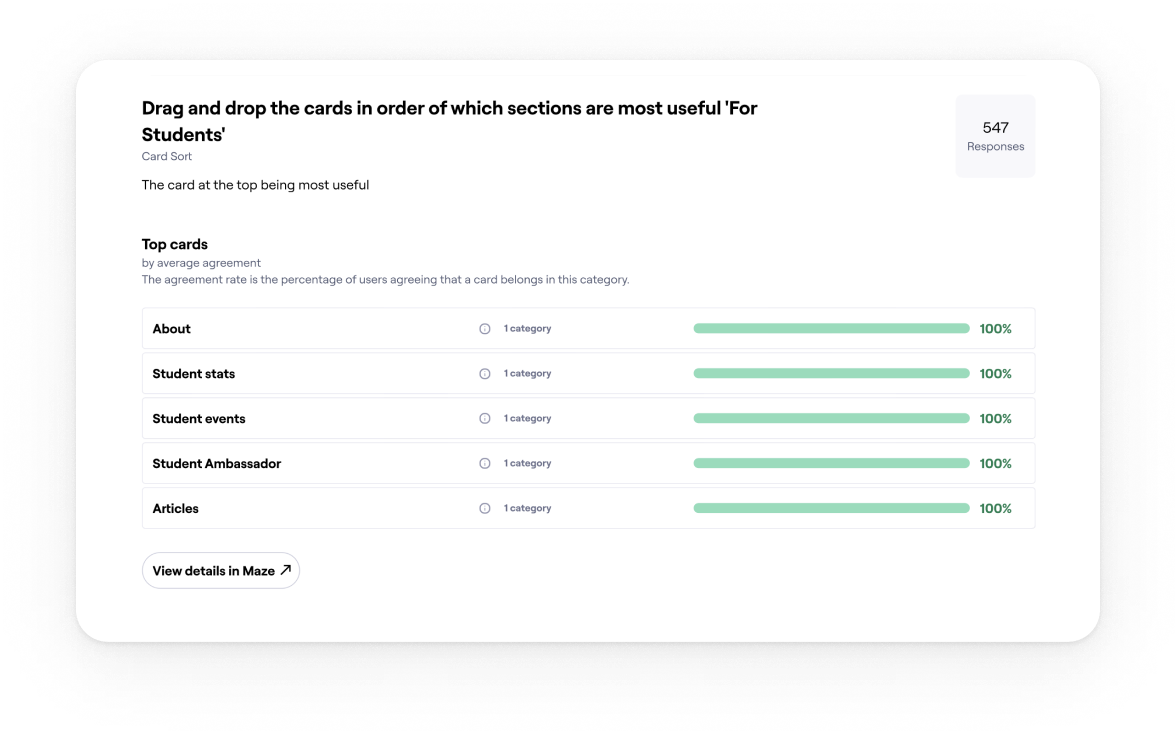
Choosing the mobile pattern
I compared a long scrolling page on mobile with a tabbed layout that mirrors the desktop sections.
Final Decision on mobile: Tabs on mobile with Overview and Rankings open.
Essentials are visible at first view. The rest collapse to reduce noise. Tabs mirror the desktop sections so the mental model stays stable. Each tab maps to a section link for search and sharing.
Validation: Mobile testing showed higher task success and a shorter time to first tap once the first two tabs were open. Add your figures here.
FINAL DESIGN
Solution at a glance
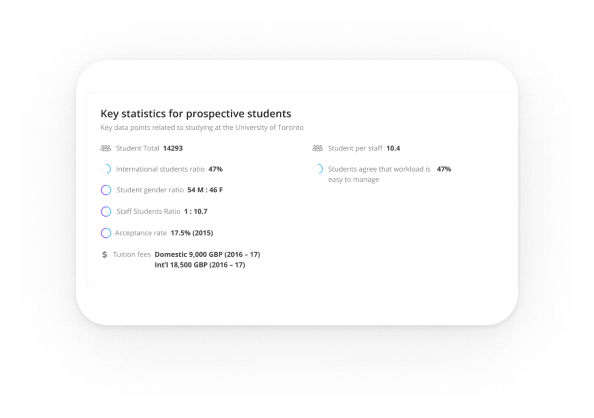
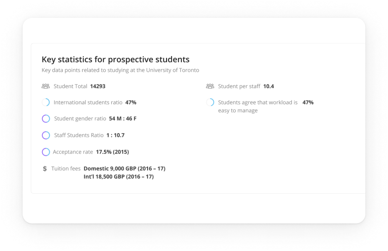
Key stats
Problem
Users arrived mid-decision and needed proof fast.
Design
A compact strip above the fold mirrors the main sections.
Impact
Quicker orientation and more clicks into the essentials.
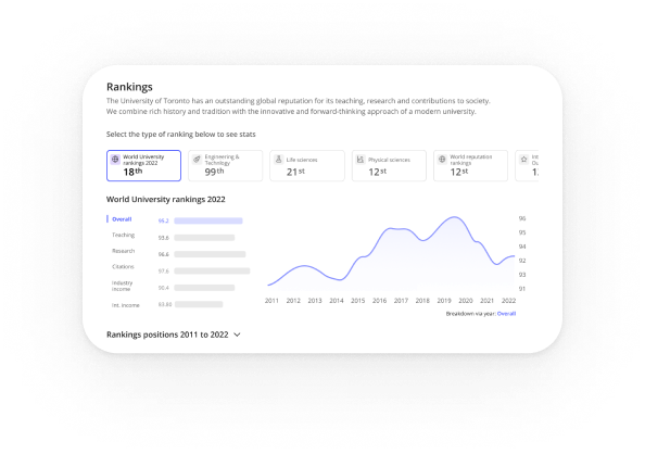
Rankings
Problem
Students compare options while academics and policy folks need citable context.
Design
Compact table shows score and trend with a visible Methodology link and Source note.
Impact
Confident comparisons for students and trustworthy citation for professional audiences.
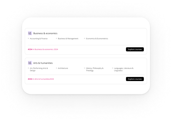
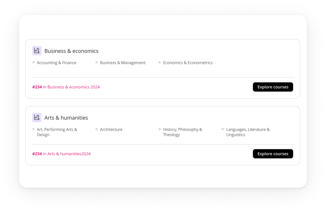
Programmes
Problem
Finding a relevant course and reaching enquiry took too many steps.
Design
Clear programme cards route straight into the enquiry flow, with a safe empty state.
Impact
Shorter path to contact and fewer dead ends.
Navigation
Problem
long pages caused misclicks on desktop and overload on mobile.
Design
sticky in-page navigation on desktop; tabs on mobile with Overview and Rankings open; anchors make every section linkable.
Impact
faster jumps, shorter time to first action, and easy growth for future sections.

Solution at a glance
IMPACT
Results
Engagement
People reached the right sections faster and spent longer with the content.
Conversions
More visitors moved from programmes to enquiry.
Trust
Professionals called out visible methodology and source as a trust signal..
LEARNINGS
What I’d carry forward
Plain labels beat clever names. Anchors must be obvious at the top and calmer on scroll. Tabs reduce mobile fatigue when only essentials open. Safe states and hide-when-empty rules unlock scale.
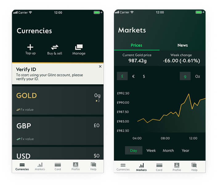
Next project
GlintPay | Fintech
App Redesign
Redesigned the iOS and Android apps end-to-end for a fintech product using open banking, creating a more
cohesive experience and improving usability across platforms.
Case studies
Pierluigi Baroncelli
Case studies
Resume
University Profiles
Shipped a scalable profile system that lifted engagement and unlocked structured data reuse across THE products.
Lead Product Design
9 months
PM, Tech Lead, 2 FE, 1 BE
Context: THE’s legacy university profile pages were inconsistent, hard to update, and not aligned with design system tokens/components.
Goal: Create a modular, data-driven profile template that scales to thousands of institutions, improves discovery, and supports commercial modules (lead gen, programme promotion).
PROBLEM
The Profiles Challenge: designing a consistent, trustworthy experience at scale
Legacy profile pages were inconsistent and costly to maintain. Content lived in multiple templates, data was duplicated, and updates were slow. Analytics showed people jumping straight to rankings, programmes, fees and admissions, yet that information was scattered. We needed a system that worked for thousands of institutions, aligned with the design system, protected SEO, and supported clearly labelled commercial modules.
Scalable and modular
Compose pages from configurable blocks built with the design system, so editors can adapt layouts by market while keeping a consistent experience.
Data-integrated and reusable
Pull from a single structured source (THE SaaS datasets), validate taxonomy, and expose blocks via a props API so content is reused across products and editorial effort drops.
Discoverable and trustworthy
Make rankings, programmes, fees and admissions easy to reach with jump navigation and clear headings; maintain AA accessibility, fast performance and stable URLs; label sponsored modules clearly.
USER NEEDS
Research insights: how students and academics read and trust university profiles
I ran stakeholder workshops with Editorial, Sales, SEO and Rankings. We combined Hotjar and analytics with Maze surveys and interviews to shape the block architecture and the content order.
01
Essentials drive decisions
Students come to decide. Fees, rankings, programmes and admissions must be visible first, so we surfaced them at the top with jump navigation.
Evidence: 77% said they would rely on the student profile to compare universities.
02
People decide fast and bounce if essentials are buried
Anchor navigation helped, but vague labels caused misclicks. Clear section names and stronger calls to action reduced friction on long pages.
Evidence: Over 80% reached the intended section in testing.
03
Long pages work when the top works
Hotjar and analytics showed early exits when essentials were buried, so we split content into modular, scannable sections.
Evidence: Structure validated with 700+ students worldwide.
04
One template cannot fit real data
Institutions publish uneven fields. We designed reusable blocks powered by DataPoints so pages adapt cleanly and scale to thousands of profiles.
Evidence: Modular sections aligned with the design system and live DataPoints indicators.
Exploration
Choosing the navigation pattern on desktop
I compared tabs, card hubs, and a long page with a sticky in-page navigation to keep orientation on data-heavy pages.
Final Decision on desktop: Use a long page with a sticky in-page nav and a key-stats strip at the top.
Faster first action: Students come to decide. Putting rankings, programmes, fees and admissions at the top lets them act quickly.
SEO and sharing stay clean: One URL with section anchors is easier to link and index.
Handles uneven data: Modular sections with sensible defaults and hide-when-empty rules keep layouts stable.
Easier to scale: New sections slot into the in-page navigation with a stable anchor.
Future proof: Anchored sections extend cleanly and keep existing links working.
ITERATION
Choosing the mobile pattern
I compared a long scrolling page on mobile with a tabbed layout that mirrors the desktop sections.
Final Decision on mobile: Tabs on mobile with Overview and Rankings open.
Essentials are visible at first view. The rest collapse to reduce noise. Tabs mirror the desktop sections so the mental model stays stable. Each tab maps to a section link for search and sharing.
Validation: Mobile testing showed higher task success and a shorter time to first tap once the first two tabs were open. Add your figures here.
FINAL DESIGN
Solution at a glance
Key stats
Problem
Users arrived mid-decision and needed proof fast.
Design
A compact strip above the fold mirrors the main sections.
Impact
Quicker orientation and more clicks into the essentials.
Rankings
Problem
Students compare options while academics and policy folks need citable context.
Design
Compact table shows score and trend with a visible Methodology link and Source note.
Impact
Confident comparisons for students and trustworthy citation for professional audiences.
Programmes
Problem
Finding a relevant course and reaching enquiry took too many steps.
Design
Clear programme cards route straight into the enquiry flow, with a safe empty state.
Impact
Shorter path to contact and fewer dead ends.
Navigation
Problem
long pages caused misclicks on desktop and overload on mobile.
Design
sticky in-page navigation on desktop; tabs on mobile with Overview and Rankings open; anchors make every section linkable.
Impact
faster jumps, shorter time to first action, and easy growth for future sections.
Solution at a glance
IMPACT
Results
Engagement
People reached the right sections faster and spent longer with the content.
Conversions
More visitors moved from programmes to enquiry.
Trust
Professionals called out visible methodology and source as a trust signal..
LEARNINGS
What I’d carry forward
Plain labels beat clever names. Anchors must be obvious at the top and calmer on scroll. Tabs reduce mobile fatigue when only essentials open. Safe states and hide-when-empty rules unlock scale.
Next project
GlintPay | Fintech
App Redesign
Redesigned the iOS and Android apps end-to-end for a fintech product using open banking, creating a more
cohesive experience and improving usability across platforms.
Case studies